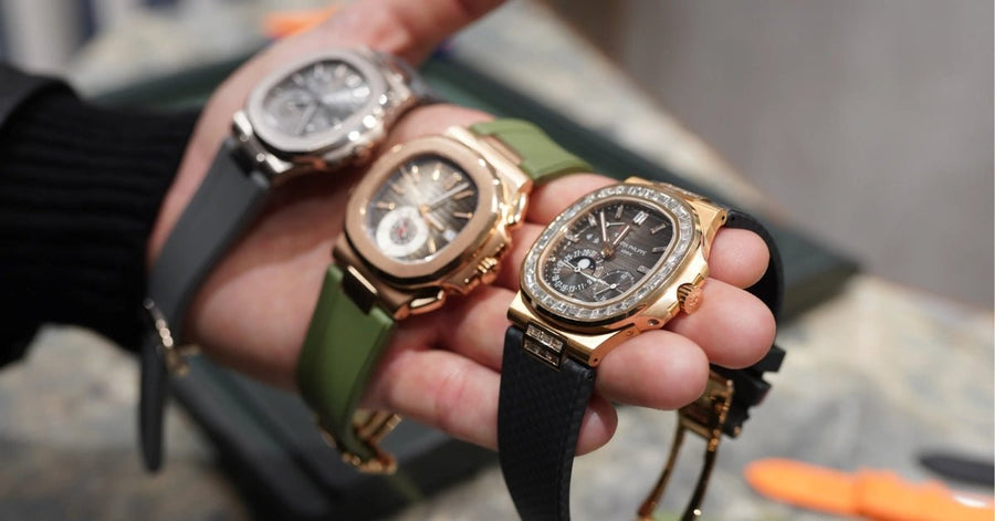

The strap is half the watch, and the strap's colour is half the strap. Get it right and a watch transforms — same case, same dial, same hands, but a completely different personality on the wrist. Get it wrong and the watch ends up looking confused, busy, or just visually off in a way you can't quite explain.
Most existing guides on strap-and-dial colour pairing are either too vague to actually use (generic "warm leather goes with gold") or too prescriptive to be helpful (rigid colour charts that don't survive a real Cartier or Rolex). This guide does neither. It walks through the three actual colour-pairing strategies that work, what each one does on the wrist, and then gives specific recommendations for the most commonly-bought luxury watches — Submariner, Santos, Speedmaster, Black Bay, Datejust, Daytona, Patek Aquanaut, AP Royal Oak, and the rest. By the end you should be able to look at any dial and pick a strap colour with confidence, whether you're matching the OEM look or deliberately going somewhere else.
The Three Colour Strategies (And What Each One Does)
Strap-and-dial pairing is fundamentally a colour theory problem, and there are three established colour theory strategies that actually translate to watches. They produce different results on the wrist and each is the right answer in different situations.
1. Tone-on-tone (monochromatic). Strap matches the dial colour exactly or stays in the same colour family. Black dial with black strap. Blue dial with blue strap. White dial with cream or off-white strap. The result is calm, integrated, and intentional — the watch reads as a single coherent object. Tone-on-tone is the safest strategy and works on every watch register from formal dress to casual sport. Downside: it can feel slightly conservative, and on a watch with a single dominant dial colour, tone-on-tone can read as flat. Best for: dressy and dressy-casual watches, formal occasions, when in doubt.
2. Analogous (close but not matching). Strap colour sits next to the dial colour on the colour wheel — same temperature, slightly different hue. Black dial with charcoal-grey or deep-navy strap. Blue dial with navy or teal strap. Brown dial with tan or chestnut strap. Cream dial with beige or honey strap. The result is harmonious without being predictable — a step more interesting than tone-on-tone but still visually unified. This is the most underused strategy in watch styling and often the most flattering. According to Sessions College's color theory reference, analogous schemes "create a smooth transition from one color to the next" and tend to feel naturally pleasing because they appear in nature constantly. On a watch, this translates to "looks designed, not just matched." Best for: collectors who want their strap to add something rather than disappear.
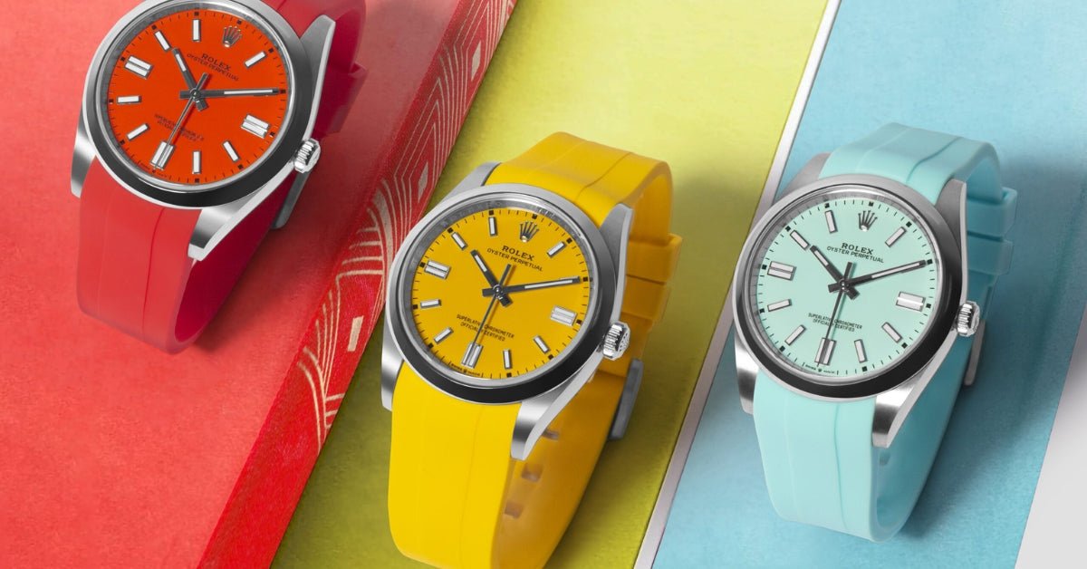
3. Complementary or accent (deliberate contrast). Strap colour sits on the opposite side of the colour wheel from the dial, or pulls a single accent colour from the dial (the seconds hand, the minute markers, the bezel triangle, the date wheel). Blue dial with orange or burgundy strap. Black dial with red or olive strap. Green dial with rust or burgundy strap. The result is high-contrast and deliberately attention-grabbing — the strap doesn't blend with the watch, it argues with it visually. Done well, complementary pairings look bold, modern, and editorial. Done badly, they look like the strap and the watch are from two different outfits. Best for: collectors with multiple straps in rotation, sport watches, summer wear, deliberate styling moments.
The single most useful pairing technique that combines two strategies: match the strap to the dial's accent colour, not the dial itself. If a black-dial Submariner has a green bezel insert (the "Hulk"), a green strap echoes the bezel. If a Datejust has a blue dial with a silver hour track, a navy strap with subtle silver-grey stitching picks up both. If a Speedmaster has a black dial with white sub-dial accents, a black strap with white contrast stitching ties the dial together. This is the move that watch stylists use and that most casual buyers miss — pairing the strap to the secondary colour on the watch rather than the primary one creates more sophisticated outcomes than tone-on-tone or random complementary choices.
Two Foundations Before You Pick a Colour
Before colour theory, two more fundamental factors set the field.
Case metal. The colour of the case (steel, gold, rose gold, white gold, two-tone) governs which strap colours look right and which look wrong. Steel cases are colour-neutral and accept almost any strap colour. Yellow gold cases want warm strap colours (brown, tan, cognac, burgundy, dark navy, off-white) and clash with cool strap colours (cool grey, ice blue, mint, lavender). Rose gold wants similarly warm tones plus deep navy and forest green. White gold and platinum behave essentially like steel. Two-tone (steel-and-gold) needs the strap to coordinate with the gold elements rather than the steel — a two-tone Datejust looks better with chestnut leather than with cool grey rubber.
Strap material. The same colour reads completely differently in different materials. "Black" in matte FKM rubber is a sport-tool register. "Black" in alligator leather is a formal-evening register. "Black" in sailcloth is a marine-utility register. The colour is the same, but the material assigns it to a completely different occasion. Always think about colour and material together, not separately.
With those two factors in mind, here's the playbook by dial colour.
Black Dials
The most common dial colour in luxury watchmaking, on everything from the Submariner to the Patek 5167. Black is the most flexible dial colour — almost any strap colour works on a black dial — but flexibility makes choice harder, not easier.
Tone-on-tone (always works): Black FKM rubber, black calfskin, black alligator, dark navy sailcloth (reads as nearly-black from a distance). The default safe option.
Analogous (the smart move): Charcoal grey FKM rubber, charcoal sailcloth, dark slate, deep oxblood (the leather has so much black in it that it reads as analogous rather than complementary). These look intentional without being safe.
Complementary (the bold move): Tan or honey leather (warm against cool black — surprisingly effective on a black-dial Datejust or Day-Date), burgundy alligator (formal dress watch with personality), olive green rubber (vintage tool-watch register), white rubber (high-contrast sport register, looks good on a Submariner or Daytona).
What to avoid: Pastel colours, mid-tone browns that don't commit (a wishy-washy beige strap on a black dial reads cheap), and bright colours that don't appear anywhere on the watch (a hot pink strap on a black-dial Submariner is a styling crime).
Pulling the accent: Most black-dial watches have an accent colour somewhere — the red text on a Sub, the green on a Submariner Hulk, the white sub-dials on a Speedmaster, the blue text on a Sea-Dweller. Pulling that accent into the strap is the single most stylish move on a black dial.
Blue Dials
The hottest dial colour in luxury watchmaking over the last fifteen years, and the dial colour where strap pairing matters most.
Tone-on-tone: Navy FKM rubber, navy alligator, navy calfskin, navy sailcloth. Looks beautiful on virtually every blue-dial watch — Submariner, Datejust blue, Speedmaster blue, Patek Aquanaut, Royal Oak blue.
Analogous: Slate grey, charcoal, deep teal. These shift the watch slightly cooler and more contemporary without disrupting the blue identity.
Complementary: Tan, cognac, or chestnut leather — this is the classic blue-watch-on-brown-strap combination that has dominated watch styling for sixty years and still works. Burgundy is the formal-evening version. Olive green is the unexpected modern option that works particularly well on Tudor Black Bay Blue and Pelagos Blue.
What to avoid: Black on a blue dial is one of the most common mistakes — it looks like the strap is "almost matching" without actually matching, and reads as a missed opportunity. If you want something that dark, go to a pure navy that's clearly the same colour family.
Pulling the accent: Blue dials often have warm accents — a red GMT hand, gold or rose-gold indices, white text. Tan or burgundy straps echo warm accents naturally.
White, Cream, and Silver Dials
The textbook dressy-casual register and the most flexible dial colour after black.
Tone-on-tone: Cream or beige leather, off-white rubber (rare but gorgeous on a Daytona or Aquanaut), light grey sailcloth. Tone-on-tone with white dials is harder than it sounds because true white straps yellow over time and rarely look right next to a white dial — go to cream, beige, or warm off-white instead.
Analogous: Light tan, sand, honey, or champagne. These pair beautifully with most silver and cream dials.
Complementary: This is where white and silver dials shine. Black strap (formal), navy strap (smart-casual), burgundy alligator (dress), chocolate brown calf (vintage), olive green (modern field-watch register), even bright colour accents on summer rotation pieces. White dials can carry almost any complementary strap because the white provides neutral background.
What to avoid: Pure brilliant white rubber on a cream dial — they fight rather than match. And pastel colours on most silver dials (lavender, mint) read juvenile.
Pulling the accent: White dials often have black hands, gold indices, or coloured second hands. Black, gold-tone leather, or accent-pulling work especially well.
Green Dials
The fastest-growing dial colour category in modern watchmaking — Rolex Submariner, Datejust, Day-Date, Tudor Black Bay 58, Cartier Santos, Speedmaster Mission to Earth, AP Royal Oak Green, Patek Aquanaut, and dozens of others now offer green dial variants.
Tone-on-tone: Olive, forest, or hunter green FKM rubber. Tonal green leather. These work especially well on the Submariner Hulk, Submariner Starbucks, and Datejust green.
Analogous: Khaki, olive-brown, dark teal, sage. Slightly warmer or cooler than the dial — looks intentional.
Complementary: Burgundy and deep red (classic green-and-red pairing — works particularly well on dress watches and on the Submariner Kermit), tan or honey leather (vintage-modern register), cream (high-contrast summer look), navy (works because navy and green are both natural palette colours).
What to avoid: Bright greens that don't match the dial exactly (a lime green strap on a forest green dial reads like a mistake). Pure black on green dials is also flat — go charcoal or navy instead.
Pulling the accent: Most green dials have warm metallic accents (gold or rose gold indices). Tan, cognac, or burgundy leather pairs naturally.
Brown, Salmon, and Champagne Dials
Less common than the colours above but increasingly popular in modern watchmaking — Datejust chocolate, Daytona panda variants, Patek 5905 salmon, Lange Saxonia salmon, Tudor Black Bay 58 bronze.
Tone-on-tone: Tonal brown leather, tan calfskin, cognac alligator. The classic vintage look.
Analogous: Honey, sand, deep oxblood — slightly warmer or cooler within the brown family.
Complementary: Navy is the surprise winner here — a navy strap on a brown or salmon dial is the most contemporary move available and looks remarkably good on a Datejust chocolate or a Saxonia salmon. Cream is the dressier version. Forest green also works on warmer brown dials (a more vintage-leaning combination).
What to avoid: Black is generally too harsh on brown dials — go to deep oxblood or navy if you want a dark strap. Bright colours look out of register.
Pulling the accent: Brown dials often have gold or warm metallic indices. Honey, tan, or cognac leather echoes them.
Grey, Slate, and Anthracite Dials
The modern minimalist register — increasingly popular on dress and sport watches alike (Rolex Datejust grey rhodium, Tudor Black Bay 58 grey, Patek 5167A grey, AP Royal Oak slate).
Tone-on-tone: Charcoal, slate, anthracite straps in any material. Looks deliberately monochrome and contemporary.
Analogous: Black (technically darker, reads as analogous on grey because both are achromatic), navy, deep brown.
Complementary: Burgundy and deep red work beautifully on grey dials. Tan and cognac add warmth. Forest green adds a vintage register.
What to avoid: Mid-tone neutrals that compete with the dial without contrasting. A medium-brown calfskin on a medium-grey dial often reads as muddy rather than coordinated.
Pulling the accent: Grey dials are often paired with bright or warm accents (red seconds hand, blue minutes, orange GMT). Pulling any of these into the strap is a strong move.
Two-Tone Dials and Sub-Dial Watches
Speedmasters, Daytonas, panda dials, reverse-panda dials, and any watch with multiple distinct colour zones on the dial.
Tone-on-tone: Match the dominant dial background colour — black for a black-dial Speedmaster, white for a panda Daytona.
Analogous: Same logic — analogous to the dominant background.
Complementary or accent: This is where two-tone dials shine. Pull the sub-dial colour, the accent register, or the contrasting element into the strap. A panda Daytona (white dial with black sub-dials) looks brilliant on a black strap — the strap echoes the sub-dials. A reverse-panda (black dial with white sub-dials) looks great on a cream strap. A Speedmaster Moonwatch (black dial, white registers) takes a black strap with white contrast stitching as one of the best stylistic options available.
Reference-by-Reference Quick Picks
The most-bought luxury watches and the strap colours that work best on each. These are starting points — your specific dial variant and personal taste modify them.
Rolex Submariner (black dial): Black FKM, navy FKM, charcoal sailcloth, olive rubber, tan leather (winter rotation).
Rolex Submariner (green dial / Hulk): Olive green FKM, black FKM, burgundy alligator (winter), navy rubber.
Rolex GMT-Master II (Pepsi): Navy FKM (matches the blue), red leather (matches the red), black rubber.
Rolex GMT-Master II (Batman): Black FKM, navy rubber, charcoal sailcloth.
Rolex Daytona (black/panda): Black with white stitching, dark navy, black FKM rubber, racing green (channelling the motorsport heritage).
Rolex Daytona (white/reverse panda): Cream alligator, dark navy, black FKM, racing green.
Rolex Datejust (any colour): Match dial tone-on-tone in alligator or calf for office wear, switch to FKM rubber in same colour family for casual wear.
Rolex Day-Date. Alligator in cognac, dark brown, navy, or burgundy. Don't put rubber on a Day-Date — wrong register.
Cartier Santos: Modern Santos works in either alligator or FKM rubber. Black, navy, burgundy alligator for dress; black or navy FKM for sport-casual.
Cartier Tank (all variants): Alligator only. Black, dark navy, burgundy, chocolate brown, or seasonal cognac. Skip rubber and sailcloth — wrong register.
Cartier Ballon Bleu: Calfskin or alligator in matching tones — black or navy for blue variants, brown or cognac for warmer variants.
Omega Speedmaster Moonwatch: Black calf with white contrast stitching (the textbook pairing), black sailcloth, black FKM rubber. NATO if you want the casual register.
Omega Seamaster Diver 300M: Match dial tone-on-tone in FKM rubber — black, blue, green depending on variant.
Tudor Black Bay (any colour): Tone-on-tone FKM rubber for sport, brown calf for vintage register, sailcloth for in-between.
Tudor Pelagos: Black or navy FKM rubber, sailcloth in deep colours.
Patek Aquanaut: Match the OEM rubber colour, or go to a Helvetus CTS-cut alternative in black, navy, or olive.
AP Royal Oak Offshore: FKM rubber in the dial colour or a darker register.
IWC Big Pilot: Brown calfskin (the textbook), black calf, sailcloth in deep tones, NATO for casual.
Panerai Luminor: Brown distressed calf (the vintage signature), black calf, FKM rubber in dark colours.
Hublot Big Bang: Match dial colour in FKM rubber, or contrast with a single accent colour.
Common Mistakes
Five styling mistakes that show up on watch forums constantly.
Matching the strap to the bezel instead of the dial. Bezels are accents; dials are the dominant colour. Match the strap to the dial unless you're deliberately pulling the bezel as an accent — and then commit to the bezel-pull as a stylistic choice.
Adding too many colours. A blue dial, a red GMT hand, a green strap, and a tan stitching colour is too many notes. Pick two or three colours total across the watch and strap, and commit.
Using black as a default. Black is the safest strap colour and the most boring. If your whole watch wardrobe is black-on-black, you're missing 80% of the styling possibilities your watches offer.
Mixing registers. A bright orange rubber on a Patek Calatrava is wrong. A formal alligator on a Pelagos is wrong. The strap needs to share register with the watch — sport with sport, dress with dress — unless you're deliberately countering for effect (and even then, only on watches that can carry a register-mix).
Ignoring the case metal. Putting a cool grey strap on a yellow gold watch creates a visual clash you'll feel without being able to articulate. Match strap warmth to case metal.
Frequently Asked Questions
Should the strap exactly match the dial, or just be in the same family? Both work. Exact matches are calmer; analogous (same family, slightly different) is more sophisticated. The wrong choice is "almost matching but not quite" — a black strap on a navy dial, or a chocolate-brown strap on a black dial. Either commit to the match or commit to the contrast.
Can I wear a brown strap with a black-dial watch? Yes — this is one of the most flexible combinations in watch styling. Tan and cognac leather on a black-dial Datejust, Speedmaster, or Tudor Black Bay all work. Avoid mid-brown straps with no warmth (they look muddy) and pure dark chocolate (sometimes reads too similar to black without matching).
What strap colour goes with everything? Black FKM rubber and black calfskin come closest to universal. Both work on virtually every dial colour and every case metal. Black calf is dressier; black rubber is sportier. If you can only own one strap colour, this is it.
Should the strap match my belt and shoes? Old-school style rules said yes. Modern watch styling is more relaxed — the watch is its own object and doesn't need to match below the waist. That said, deeply mismatched warmth (a tan strap with black shoes and a black belt) can look uncoordinated. Match warmth, not necessarily exact colour.
What about matching stitching to dial accents? This is the most sophisticated detail in strap styling. White stitching on a black strap pulls the white sub-dial accents on a Speedmaster. Red stitching on a black strap echoes the red text on a Submariner. Tonal stitching (matching the strap colour) is the safest and dressiest option; contrast stitching is the more playful one.
Does dial colour matter more for leather or rubber? Both, but in different ways. Leather has more colour variation and more tonal subtlety, so leather choices reward thinking. Rubber is more saturated and reads as a flat colour from distance, so rubber choices are more about commitment to a single tone.
Can I have a single watch and rotate four straps? Yes — this is increasingly common. Most rotation collectors run black FKM rubber for sport, brown calf for daily, an alligator for dress, and one accent colour for variety. That covers virtually every situation a daily-wear watch will see.
The Bottom Line
There are three working strategies for pairing strap colour to dial: tone-on-tone (calm, integrated), analogous (harmonious, sophisticated), and complementary or accent (bold, attention-getting). All three work; they just produce different results. Most underused: pulling the dial's accent colour into the strap. Most overused: defaulting to black on every watch.
The two foundations matter as much as the colour choice itself: case metal (yellow gold needs warm straps; steel takes anything; rose gold prefers warm + navy/forest) and material register (rubber is sport, calf is daily, alligator is dress, sailcloth is in-between). Pick those right and the colour choice becomes much easier.
If you're starting a strap rotation from scratch, the most flexible four-strap wardrobe is: black FKM rubber for sport, brown or navy calfskin for daily, a dressy alligator (black or burgundy) for formal occasions, and one accent piece (forest green, deep red, ostrich, or anything that pulls the dial's secondary colour). That covers virtually every dial colour and every situation a luxury watch will see.
Helvetus offers strap colours across every material in the modern aftermarket — over 20 colourways in curved-end FKM rubber and straight-end FKM rubber, full ranges in calfskin leather, alligator, sailcloth, suede, ostrich, and denim — engineered to fit the case profiles of every major luxury watch reference.
Most of our customers wear Rolex or Cartier. The Rolex strap collection covers every dial colour Rolex produces, with strap colours specifically curated to match or contrast with each. The Cartier strap collection covers Santos, Tank, Pasha, Ballon Bleu, and Ronde with the appropriate colour and material registers for each. Browse the full range at helvetus.com, use our Strap Finder to match strap, end-fit, and colour to your specific watch reference, or read more on the Helvetus blog.